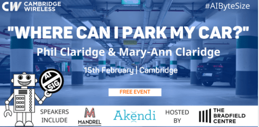
Mary-Ann Claridge and Phil Claridge from @MandrelSystems will be talking about where to park your car in #Cambridge using real world end-to-end examples of #ML using #SmartCity Data at #AIByteSize – Register at: http://ow.ly/RkGg30i5mzL
Mary-Ann Claridge and Phil Claridge from @MandrelSystems will be talking about where to park your car in #Cambridge using real world end-to-end examples of #ML using #SmartCity Data at #AIByteSize – Register at: http://ow.ly/RkGg30i5mzL
Spent the weekend, appropriately, on a busman’s holiday looking at data from the TfL data sets.
Saw a few interesting approaches. Some would really shine with a couple of extra days to complete the analysis.
Here’s the presentation Phil & I produced of our recommendations for the underlying topological reference data model.
We spent some time at Lyme in the summer. Here’s how I unwound. Click on the images for a bigger view


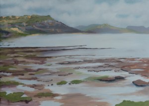


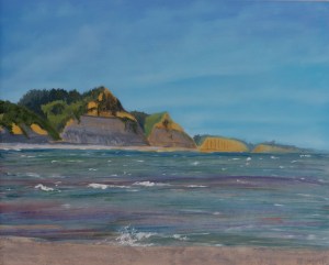

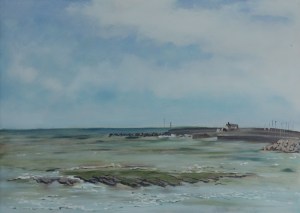


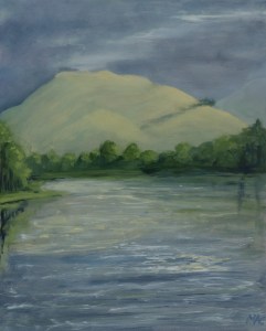
For anyone interested, oil on board, started plain air (i.e. from life out in the open) finished off at home to insert details.
All the images are Copyright Mary-Ann Claridge 2015. All Rights Reserved
From my keynote talk at the Cambridge Wireless event:
The slides are now available from the CW website
While giving an overview of the tooling available, I presented questions that should be considered in selecting tools for Big Data projects:
Where is the area of difficulty? ‘Traditional’ tools such as Excel may be quite adequate for a quick look at a sample of data, or familiar tools such as R may allow domain experts to model data and devise processing algorithms more quickly.
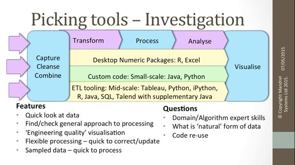
How fast will data be received, and how much will there be? This will determine whether tools such as Hadoop are needed.
How soon will processed results be needed? If this a genuine streamed application, Storm should be considered, but often, what is initially thought of as a streaming project is simply a data capture problem, with a ‘fast batch’ processing chain.
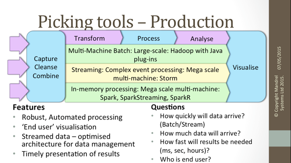
Different tooling may well be used at investigation and production stages. While re-use is desirable, it may sometimes be better to use the best tool for each stage, making a clean start into production after the task is clearly defined.
At the Hortonworks seminar on Hadoop for Modern Data Architectures, today, there was a lot of discussion around the skills required to get maximum value from the floods of data pouring in from sensors, websites, machine logs, phone data and the rest of the BigData deluge. At the Hortonworks Data Science workshop, the experiences needed in a Data Scientist were listed as
Apparently this skill set is so rare that the Hortonworks team recommend their customers recruit data science teams, rather than hunting this mythical Unicorn. From their presentation … 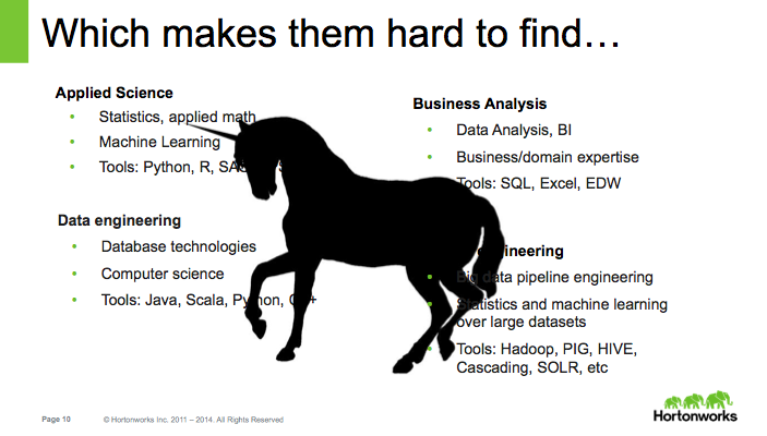 For years, I’ve struggled to know what label to put on my CV – apparently I should say Unicorn. Continue reading “So, now I’m a Unicorn…”
I was at the Strata-Hadoop conference in Barcelona at the end of November, and noted a few trends in Big Data analysis which may be of general interest.
In the early stages of a tooling lifecycle there seems to be a level of evangelism amongst people who get together to talk about it. Hadoop has passed that stage. Admittedly this was a Hadoop event, so you would expect a higher degree of familiarity than elsewhere, but I was surprised at just how mainstream Hadoop felt.
While MapReduce on Hadoop allows very fast efficient number crunching, it isn’t ideal for complex queries or computations. It’s good for production scale implementation of pre-defined calculations, but not for the explorations necessary to define the process. Data scientists, including me, were talking about use of Spark to fill this gap – it has memory resident data for fast multi-machine processing, comes with a machine learning library, provides easy extension from R or Python and can run the complex tasks needed for investigative analysis.
Real-time import of streamed data was a constant theme. There was a lot of discussion on just how much real-time processing is actually necessary – data may stream in, but results are often not needed in anything like real-time. The use of new architectures (including lambda and kappa) to handle this data pipe were discussed. While Storm for genuine real-time processing was mentioned, most speakers seemed to find reasons for their process outputs to be batch, or micro-batch, and so avoid moving to genuine real-time processing.
Algorithms used to have to be designed to work with the limited storage space of early computers, for instance by holding a few summary variables, or acting on data subsets. As disks became cheaper, this constraint was removed. Now, as data storage and processing are memory resident, well designed storage efficient algorithms, and procedures are becoming necessary again. Experience from previous generation computing suddenly looks extremely useful again.
Historically, consumers would ask questions, then data experts would go away, collect and store data, work out how to process it and then produce reports (hopefully) answering the questions. The trend is for consumers to query the data themselves. This places a number of requirements on the data capture, and processing – it has to be cleaned and stored to facilitate the queries, with flexible transparent tooling that ensures the results obtained by a (probably statistically uneducated) query are not misleading. The role of the data scientist changes from report generator to educator, adviser and validator.
15 AUGUST 2013 |
But data show that grades in each subject may be rather more equal
2 MAY 2013 |
Overseas students beat UK peers’ tariff scores on many courses, analysis suggests
21 FEBRUARY 2013 |
But private pupils do not suffer discrimination, expert argues
How do you define whether one University course is ‘better’ than another?
Here are the results of an analysis I undertook, for bestCourse4Me.com to give The Daily Telegraph a set of courses which could be described as better than Oxbridge.
So what does make one course better than another? It could be the rigour of the academic study, or the quality of teaching, or any number of criteria. For this study, I took the objective measures of employment outcomes: probability of employment at the end of the course, and starting salary. The employment and salary data were averaged over 2 years to reduce the chance of ‘blips’, and to increase the population of students studied.
To be considered, a course had to exist at either Oxford or Cambridge – not necessarily both, as that would have excluded all sciences, since the Natural Science course at Cambridge would not be directly comparable with a ‘single subject’ science course elsewhere. Only first degrees were considered.
The ‘gotchas’ in the analysis were that
I would take the survey as it was reported – not definitive, but indicating courses that would definitely be worth a look.
Big Data is becoming a fashionable phrase in the world of IT. But what does it mean, and is it useful?
For some people, Big Data is more data than can be processed on a single machine. For others it is the combination of data from more than 1 source.
bestCourse4Me.com is an example of the 2nd type of Big Data, it combines data from HESA, the official agency holding data on all university entrants – their entry qualifications and outcomes on leaving university – with the ONS Quarterly Labour Force Survey to allow 6th Form pupils to make informed decisions about University courses.
This is the first time these data sources had been combined. One question that had to be answered was whether the combination was valid. Fortunately the 2 organisations did use the same standards to classify degree subjects and to classify the occupations taken in later life. A little work had to be carried out in aggregating the data from the 2 sets to the same levels, and in matching different versions of the standards, but then I tried to find some areas where the data sets met, to see whether they produced comparable results.
I selected employed graduates aged 21-23 from the ONS surveys over a 3 year period, and selected only employed graduates in the same range from the HESA leavers data, then grouped the data by degree subject and career taken, and compared the salaries in the 2 data sets. This showed that the data sets were not exactly matched, but were close enough to accept the data combination.
This data combination then seemed clean enough to power the website, and give students and their advisers reliable information.
The Daily Telegraph presented an extract of this information as part of their university advice.
I want to compare the design decisions taken in presenting data on a web site, and a mobile app.
The example I am using is www.bestCourse4Me.com.
This is a charitable site aimed at Sixth Form students and their advisers, to allow students to make informed decisions about University courses, and the A levels needed for their degree course. It has data for every student at every UK university on:
This is combined with sampled data on employment status on leaving – career taken and salary, and the ONS Labour Force Survey, giving sampled employment status and salary over the lifetime.
Some students may know exactly what they want to do in life, and simply need to know how to achieve this – what degree subject and University to choose, and the A levels subjects and grades that will give them the best chance of being accepted onto their chosen course. Many will have no idea of what they want to do, and need to explore the possibilities from their current position.
The web site can make use of large screen area to present a lot of data, and to compare selections. The mobile app needs to present a smaller amount of data in a more task centred way. While it would be ideal to have a common design and code base for the 2 presentations, their constraints were so different that I decided it would be worth having different designs.
With this in mind, the web design shows a chronological flow through the options and outcomes.
The earliest stage of life is at the left, and the outcomes at the right. Users can move in either direction through the pages, trying options, then moving right to see the outcomes, or left to see the requirements, For example, a student may be interested in a degree course in Forensic Science, from this she could move right to the university tab to see the universities offering this course, then further right to see the careers taken by previous graduates in Forensic Science, or she could move left to the Alevel tab to see the A levels required for this course. This design allows users to explore the data from any point in the decision process.
There is a considerable amount of useful information available to users, to indicate previous outcomes of the options selected by user, which is not easily explored – this was too useful to leave out, but too confusing to show on the single browsing (selection) pages, so this is all included in a single summary page on the right. This also makes a useful printable summary page for careers teachers to give students to take away.
The web site had been in use for several months before work started on the mobile app. An app, rather than mobile web site was selected to ensure a responsive experience. Since the target users were not expected to have the latest phones, I could not assume the phone would have a SQLite, or any other database. This limited the amount and structure of data held in the app.
I also had to allow for the limited screen space of low-end phones, and the reputed short attention span of reluctant teenagers.
I set up a few questions that the user had to be able to answer in the minimal number of screens:
This led to a few obvious data presentations – selection lists for each of the main objects (Alevels, Degrees, Universities and Careers), and graphs of answers such as pie charts of degrees taken by students with a selected A level subject.
Adding a few extra links to allow progress between related screens, such as from A levels to Degrees to Careers, led to the final screen structure.
This is a really nice example, of trying to present the same data, for the same users on different platforms. The critical design decision was to use the freer environment of the website to encourage exploration of the data, whilst using a rigorously task focused approach in the more constrained environment of the mobile app.
